Case study
Sareena
ProjectFull visual identity
Year2026
ApplicationsPrint and social
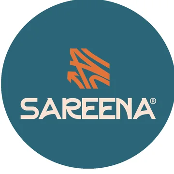
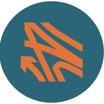
Sweeping lines and an arrow that points forward. One mark, as strong on paper as on a phone.
We built Sareena a complete visual system: the logo and its mark, a tight palette, a pattern drawn from the logo's own lines, and ready templates for stationery and social media, so every piece looks like it comes from the same place.
- Logo versions7
- Brand pattern1
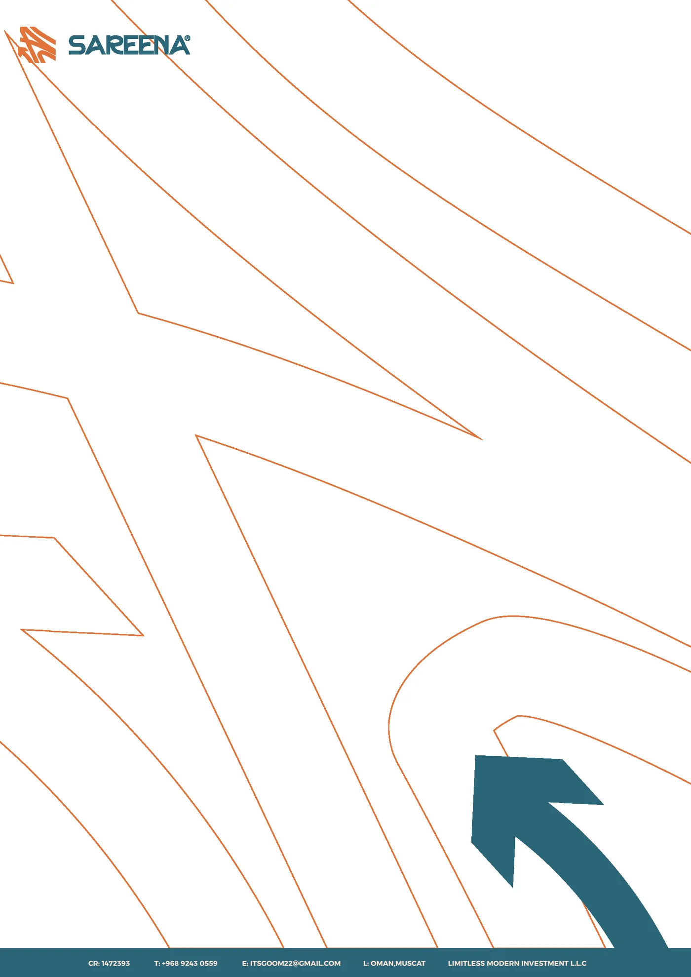
- Letterhead1
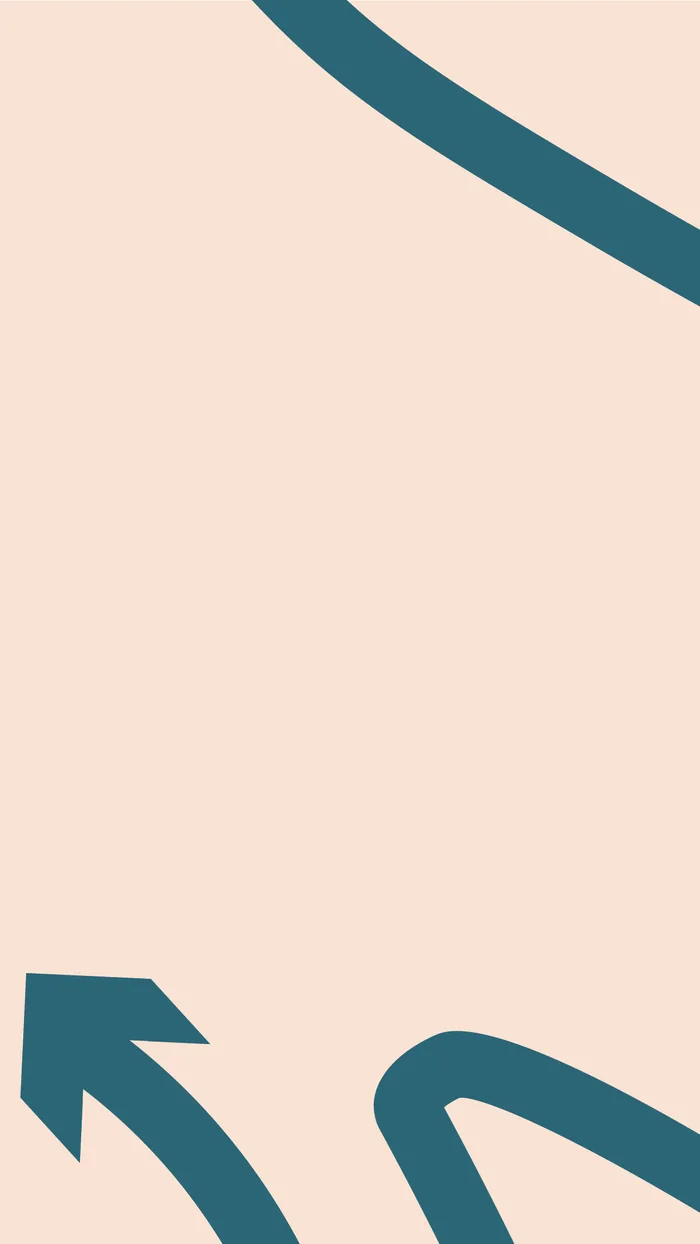
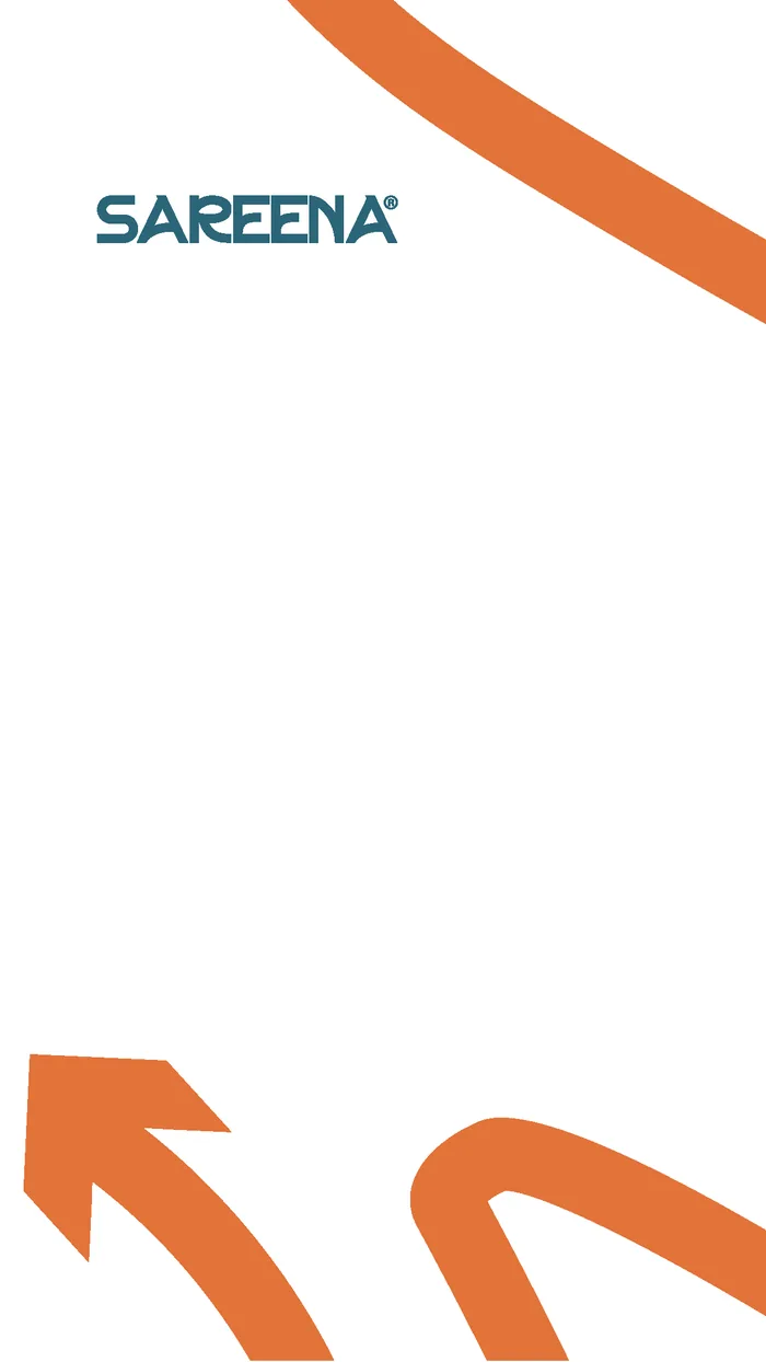
- Story templates5
- Highlight covers8
- Brand guidelines1
Colour
Deep teal carries the brand. Orange is kept for the moments that need to be seen.
Deep teal
#0B677AOrange
#F36B21Blush
#FEE2D2Charcoal
#3D474E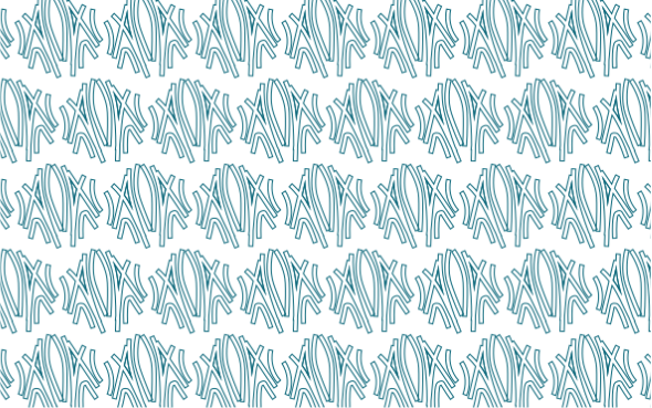
Stationery
A letterhead that still looks like the brand when it's printed in an office.
The logo's lines run quietly behind the page, and the arrow closes it at the corner.
Story templates
Ready backgrounds the team fills in, so every story stays on brand.

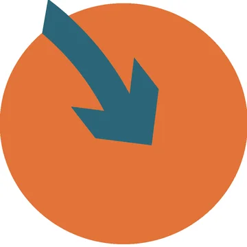
Highlight covers
Pieces of the mark, cropped to Instagram's circle.



Want your brand to look this sure of itself?
Tell us about your project. We'll send your quote on WhatsApp.
Next projectEman